Surfside Properties (Rebrand)
Personal Role: Art Direction, Design, Motion
Creative Direction, Project Management: Barry Pesner
Personal Role: Art Direction, Design, Motion
Creative Direction, Project Management: Barry Pesner
2022
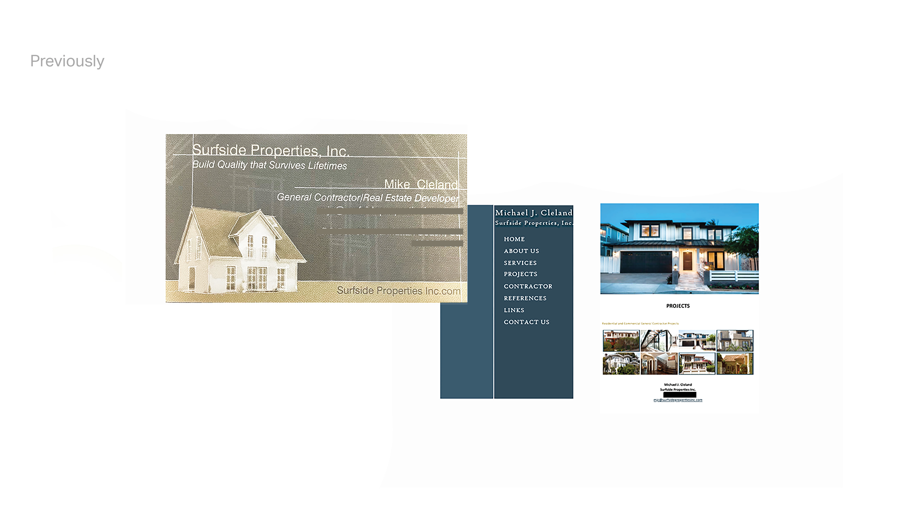
While at Exact Printing & Packaging Inc., I was able to take on the challenge of rebranding Surfside Properties Inc. The owner is an expert contractor, and real estate developer, with 40 years of experience. Like most seasoned business owners, he wanted to carry over that legacy into new branding, while adding a modern touch to appeal to his growing, younger client base. Finding a balance of familiarity and freshness was the core challenge of Surfside's rebrand.

About
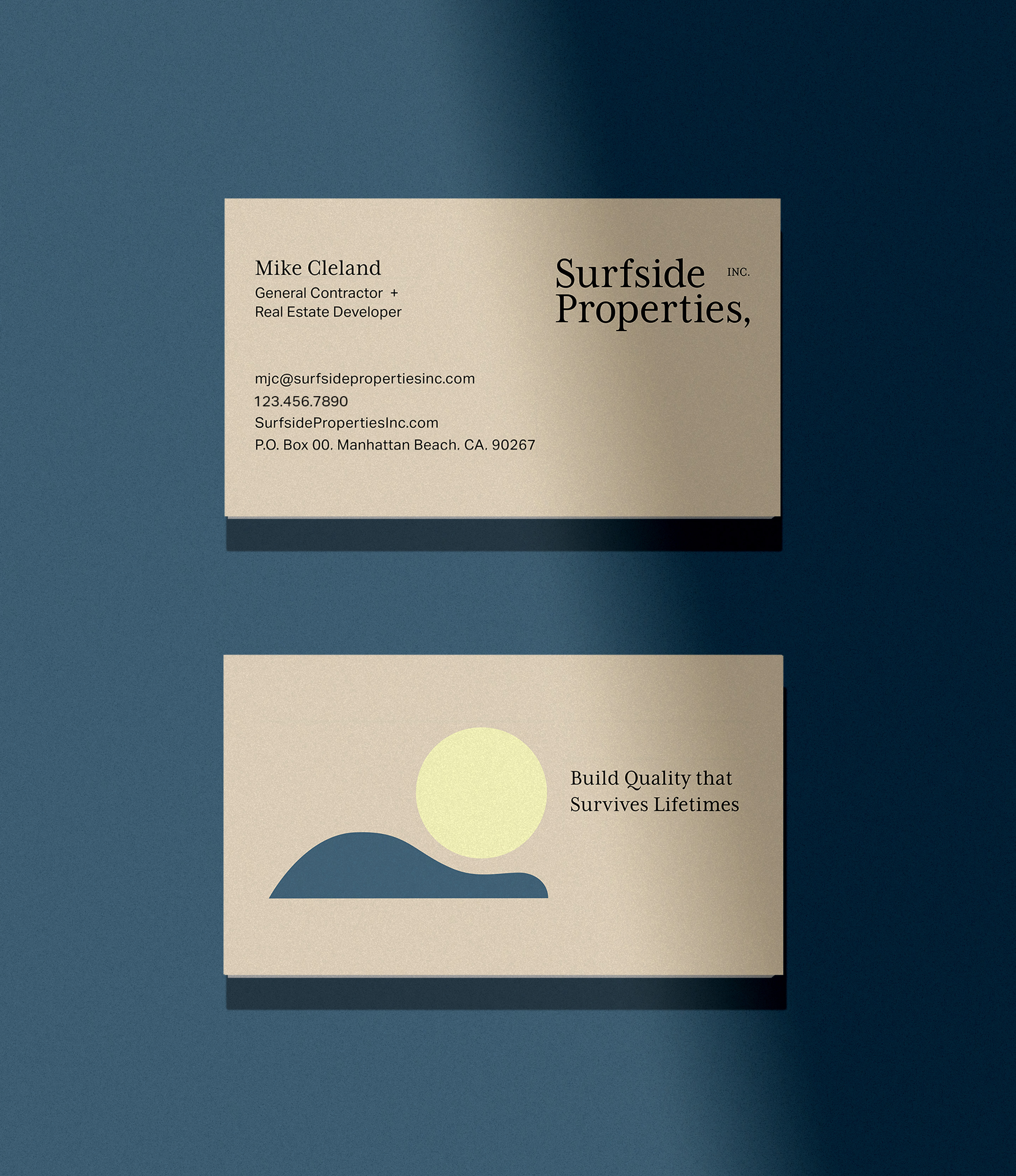
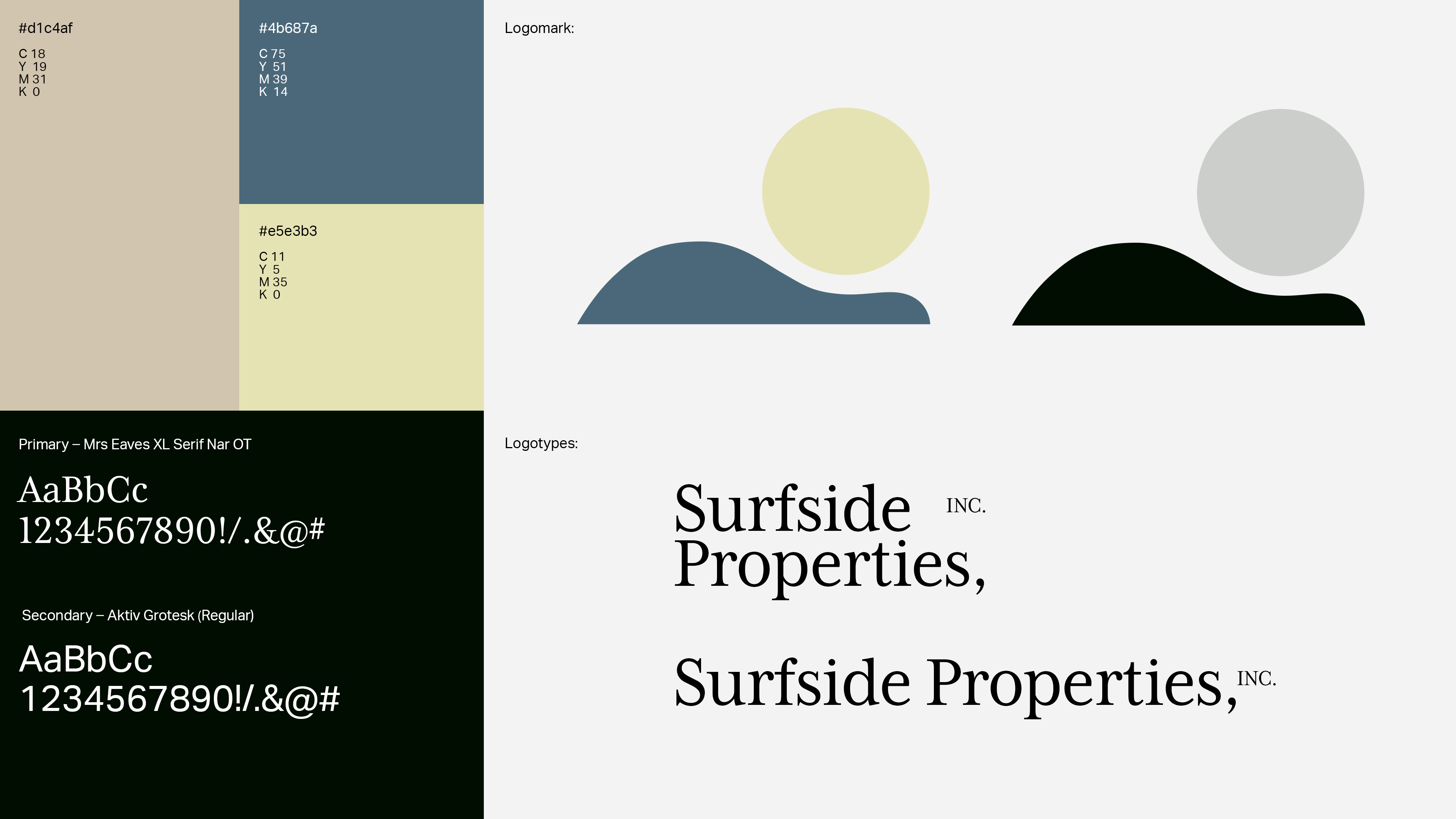
One of the main goals of re-branding Surfside Properties, was to give the brand what was missing most: a distinct logomark. Although many real estate/property development companies throughout Southern California have an ocean or sunset theme in their visual language, the intention behind the new mark was to follow this trend within the market, while using a more modern, abstract, and minimal approach.
The two shapes precisely relate to one another, in a way that hints at all the careful planning, constructing, and artistry that goes into each client’s property. To carry over some familiarity, I kept similar deep blue and neutral tan swatches, and added a touch of brightness with a new yellow tint. The logotype serif font Mrs Eaves XL Serif Nar OT is reminiscent of the previous serif font, but with a more distinct typesetting.